Oppenheimer once spoke of combining physics and New Mexico, with world-changing results. My ambitions are more modest. As the courts ease into vacation mode, I’m bringing together two long-standing interests of mine: law and flags.
That takes us to the Supreme Court’s ceremonial flag, which was launched with ceremony in 2024, then quietly forgotten earlier this year. This article unpacks what went wrong, and then attempts a small design experiment of its own: imagining a better flag and a clearer way forward.
A Grand Unveiling

In September 2024, President Droupadi Murmu unveiled a new emblem and flag for the Supreme Court as part of its 75th anniversary celebrations that replaced the Court’s long-standing logo featuring the Ashoka Sarnath lions with a fresh composition of symbols.[1]
The new emblem brought together the Ashoka Chakra, the Supreme Court building, and an open Constitution, all framed within concentric circles and crowned by the Sanskrit motto “Yato Dharmastato Jayah” (Where there is Dharma, there is victory).[2] The flag was essentially this new emblem in its entirety, transferred wholesale onto a deep blue background.[3]
Flags Beyond Nations
While flags are mostly associated with nations, it is not uncommon to see institutions and organisations and even courts have their own flags. Around the world, great institutional flags become part of civic culture.
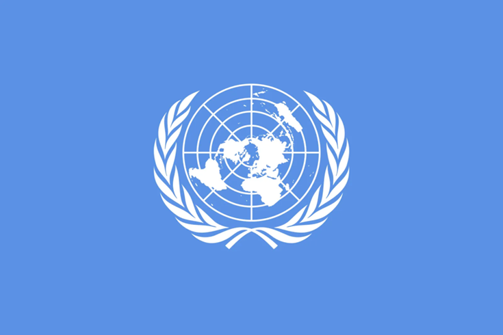
Take the flag of the United Nations. It’s iconic, minimalist and instantly recognisable. It adorns peacekeepers’ uniforms, flies outside embassies and missions, hangs in classrooms, and is worn with pride by generations of Model UN participants who have never set foot near the Security Council. Its symbolism has travelled far beyond the institution itself.[4]
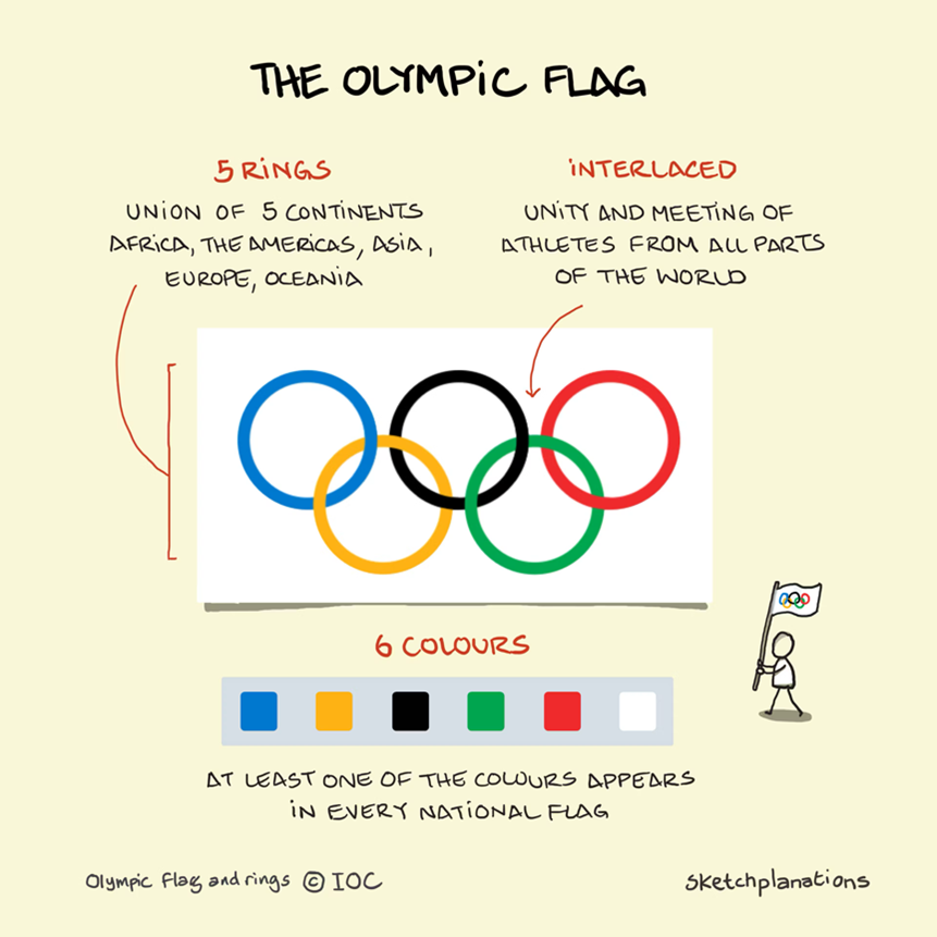
The Olympic flag is just as powerful. Five interlocking rings on a white field. So simple that even a child can draw it, yet so meaningful that athletes permanently tattoo it onto their bodies. It flies at stadiums and flies alongside the flag of the host nation every four years when the Olympic games are organised.[5]
The Red Cross flag may be the strongest example of all: a single red cross on white is so widely accepted and respected that it enjoys legal protection under international humanitarian law.[7] A flag that can literally save lives because the world understands, instantly and without text, what it stands for.

And then we have the flag of the Supreme Court of India.
Despite a grand launch by the President and the Chief Justice, the flag was never used. It didn’t fly on the Supreme Court building. It wasn’t seen on cars, inside courtrooms, or anywhere on official material. In short, it disappeared. A symbol meant to represent visible identity of the Court ended up disappearing, never being part of its public identity.
The final blow came in May 2025, when Chief Justice B.R. Gavai restored the Court’s old Sarnath Lion emblem.[8] The flag was never officially withdrawn, but once its emblem was removed, it simply couldn’t survive. For a flag that never caught on, this was the gentle but definite end.
In the end, the failure of the Supreme Court flag is easy to explain. It was a design that didn’t work and a decision made without wide based consultation with relevant stakeholders. A flag cannot succeed if it is imposed rather than embraced. This one was both complicated and disconnected, and so it quietly faded away.
What Makes a Good Flag?
Flags are deceptively simple things, yet immensely powerful. They convey principles, stir deep feelings, and create instant recognition. A great flag travels far. It appears on buildings, clothing, badges, protests, and celebrations.
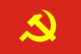
Think of the communist hammer and sickle, a striking emblem displayed proudly from Hanoi to Havana. Or consider the rainbow Pride flag, a simple band of colours that has become a global symbol of diversity, identity, safety, and solidarity. Flags may be just pieces of cloth, but they carry meaning far louder than their material suggests. Their power comes from the emotions they inspire.

These flags work because they follow fundamental principles of good design. The North American Vexillological Association has recognised five basic principles for effective flag design:[9]
- Keep It Simple: The flag should be so simple that a child can draw it from memory. Complexity is the enemy of recognition and reproduction.
- Use Meaningful Symbolism: The flag’s images, colours, or patterns should relate directly to what it symbolizes. Every element should tell part of the story.
- Use 2 or 3 Basic Colours: Limit the number of colours to three at most. They should contrast well and come from the standard colour set. Too many colours create visual chaos.
- No Lettering or Seals: Never use writing of any kind or an organization’s seal. A flag should communicate through visual language, not require reading lessons.
- Be Distinctive or Be Related: Avoid duplicating other flags, but use similarities to show meaningful connections. Strike a balance between uniqueness and contextual relevance.
How the Supreme Court Flag Fails
In reality, the Supreme Court’s flag ignores the basics of flag design. It shows how easily a flag can go wrong when the fundamentals are forgotten.
Failure #1: Too Much Going On
The first rule of flag design is simplicity, and the Supreme Court flag ignores it completely. It tries to fit in an open book (supposedly the Constitution), the Supreme Court building, the Ashoka Chakra, two rings around all of it, and a Sanskrit motto. That’s five different ideas squeezed into one crowded design.
Try drawing it from memory and you’ll see how impossible it is. This isn’t a flag you can recognise at a glance; it looks more like a detailed illustration printed on cloth, not something meant to fly and be seen from far away. A good flag needs one strong idea, but this one has far too many.
Failure #2: No coherent symbolism
The second problem is with symbolism. Yes, the elements on the flag do have meaning, the open book is meant to represent the Constitution, the Ashoka Chakra stands for dharma, and the Court building signals the institution itself. But simply placing all these symbols together does not create a strong or clear message. It feels more like a collection of parts than a unified idea.
So while the individual symbols have meaning, the overall design does not. The flag doesn’t communicate a clear idea of what the Supreme Court stands for.
Failure #3: Colour Catastrophe
This is where the flag struggles most. The dark blue and gold combination doesn’t create the strong, striking look a flag needs. The colours don’t highlight each other; they sit heavily together and make the design look dull. But the real problem is deeper: the colours mean nothing for the Supreme Court. Nothing about the Court’s appearance, history, or public image has anything to do with navy blue or gold. These colours are not part of its story.
So why were they chosen? What do they represent? It is hard to tell. They are not colours that speak to the Supreme Court’s heritage. There is no cultural, historical, or institutional reason for this palette.
A flag’s colours should reflect the institution it represents. They should feel natural, meaningful, and familiar. In this case, the colours feel picked from a catalogue, elegant perhaps, but completely disconnected from the Supreme Court’s identity. When the colours have no link to the institution, the flag cannot inspire pride or recognition. It becomes a design without a story.
Failure #4: The Text and Seal situation
The flag also includes the motto “Yato Dharmastato Jayah” written in Devanagari. This alone breaks a basic rule of flag design: a flag should not use text. A flag has to speak through shapes and colours, not through words. People should be able to recognise it instantly, even if they don’t know the language. That’s why the American flag doesn’t spell out “United States,” the Japanese flag doesn’t say “Nippon,” and the Canadian flag doesn’t label its maple leaf. A strong flag communicates without reading.
The Supreme Court flag also breaks the second part of the same rule: a flag should not use a detailed seal. A seal is meant for documents that are looked at up close, where fine lines and text can be read clearly. A flag, however, is seen from far away and while it is moving. The small details blur, the text becomes unreadable, and the entire design loses meaning the moment the fabric shifts in the wind. This is exactly what happens with the Supreme Court flag.
The emblem, with its building, motto, rings, and book, was created as a seal, not as a flag symbol, and it simply cannot function on cloth the way a flag needs to. The flag’s central element fails because it was clearly first designed as an emblem, its use on the flag is evidently an afterthought.
Failure #5: Symbols Without a Link
A strong flag should either stand out clearly on its own or connect to something people already recognise. The Supreme Court flag manages neither. Nothing about its design makes you instantly think, “This belongs to the Supreme Court of India.” The colours are generic, the shapes are busy, and the overall look could be mistaken for almost any government department.
It also misses the chance to build a meaningful visual link to symbols people already know. The Supreme Court building, which could have been turned into a simple, iconic silhouette, is drawn with so much detail that it becomes decoration rather than a symbol. Nothing on the flag creates an immediate, memorable connection in the viewer’s mind.
This is where it falls short compared to strong institutional flags like the UN or the Red Cross. Those flags use one bold, simple idea that anyone can recognise instantly. The Supreme Court flag uses many elements, but ends up with no clear identity at all.
Redesigning the Supreme Court Flag: A Thought Experiment
Before abandoning the concept of a Supreme Court flag entirely, it helps to approach the question as a design exploration. If the five basic principles were applied carefully, and only symbols rooted in the Court’s identity were used, the result could be a flag that is simple, dignified, and immediately recognisable. If I were to design a flag for the Supreme Court, this is the approach I would take.
1. Simplicity: The Building as Icon
The most obvious and powerful symbol of the Supreme Court is its building, in particular the central dome. Over the decades, this dome has become the Court’s visual shorthand. It appears every time the Supreme Court is mentioned in newspapers or on television, and it is what people across the country picture when they think of the institution. For litigants, it is the first thing they see when they enter the Court’s gates and the image they carry with them long after they leave.
That is why it works. The solution is not to draw the building in detail, but to reduce it to its simplest form, a clean outline or geometric shape that captures the dome’s profile. Something a child can draw. Simple, memorable, and unmistakably Supreme Court.
One way to see the Supreme Court is from above, viewed this way, the Supreme Court building appears as a large central dome surrounded by four smaller domed structures, known as chhatris. These chhatris are traditional architectural elements, commonly seen in Indian buildings, and they frame the main dome in a way that reflects balance, symmetry and order.
2. Meaningful Symbolism: Architecture and Dharma
The symbolism, in my opinion, also needs to reflect the Constitution, which creates the institution of the Supreme Court as the apex court of Sovereign India.
The Preamble commits the Republic to five core ideals, Justice, Liberty, Equality, Fraternity, and Democratic Sovereignty (We, the People). These are the principles the Supreme Court exists to protect.
I would reflect the constitution, not literally as an open book but through symbolism that reflects its core values.
3. Basic Colors: Sandstone, White, and Strategic Accents
The building’s natural color palette gives us everything we need:
- Sandstone red: The warm, earthy colour of the building itself
- White: The dome and architectural highlights, representing purity and transparency.
These colours are distinctive, meaningful, and work well together. They’re also uniquely Indian, sandstone architecture is part of our architectural heritage.
4. No Lettering or Seals
I would lose the text entirely. “Yato Dharmastato Jayah” is beautiful, meaningful, and important, but it belongs on documents, not on a flag. The flag should communicate visually. If the motto is to be displayed, it can appear on the flagpole base or accompanying materials, not on the flag itself. I would leave out the seal entirely.
5. Distinctive Yet Connected
The Supreme Court building silhouette makes it distinctive: “This is the Supreme Court specifically.” No other institution in India has this architectural icon. It’s unique, recognizable, and carries decades of symbolic weight.
Putting it all together:

Taken together, this design brings all the principles of good flag-making into one coherent whole. The flag is built around a single, unmistakable idea: the Supreme Court as an institution rooted in the Constitution. The large central circle reflects the Court’s iconic dome, instantly recognisable across the country, while the four surrounding circles echo the chhatris seen from above, creating balance and symmetry echoing the scales of justice.
At the same time, the use of five circles connects the design to the Constitution itself, the five core ideals of the Preamble that the Supreme Court exists to protect. The colours draw directly from the Court’s own building, grounding the flag in its physical and institutional identity, while the absence of text and seals ensures clarity, visibility, and dignity.
Simple enough to be drawn from memory, meaningful without explanation, and distinctive without excess, the flag communicates the Supreme Court’s authority and purpose in the way a flag should : through form, colour, and symbol alone.
The flag above is only a personal design exercise. It is not offered as a final answer or an official alternative, but as a way of thinking through what a Supreme Court flag could look like if the fundamentals of flag design were applied carefully. It is a response to the earlier design, not a claim to perfection of finality.
Way forward
The 75th anniversary flag appears to have been designed and unveiled with very little public discussion, not about whether the Supreme Court even needed a flag, not about what purpose such a flag would serve, and certainly not about how it should look. The process seems to have involved a small group of decision-makers, and many within the legal community were taken by surprise when the flag was launched.[10] [11] The fact that the emblem and flag were quietly set aside by the very next Chief Justice of India only reinforces the sense that the design never enjoyed broad institutional support.
If the Supreme Court is to revisit the idea of a flag, the first step must be clarity of purpose. Why does the Court need a flag at all? Is it meant to serve as a ceremonial symbol, an institutional identifier, or a visual shorthand for constitutional authority? Until that question is answered, any design exercise risks becoming cosmetic rather than meaningful.
Equally important is how such a flag is designed. The most successful flags in the world have rarely emerged from closed rooms. National flags, whether the Indian tricolour, South Africa’s post-apartheid flag[12], or Canada’s maple leaf[13] were shaped through deliberate public engagement and political consensus, precisely because they were meant to represent more than just an institution or individual. Even non-state flags like the Rainbow Pride flag[14] gained their power not through official decree but through open adoption, reinterpretation, and collective ownership. Their strength lies as much in acceptance as in design.


Consider the design and adoption of the ₹ symbol. It was not imposed from above. It emerged from an open, nationwide competition, was evaluated by a broad committee, and ultimately succeeded because it combined simplicity, symbolism and sound design principles with wide acceptance.[15] Today, no one associates it with the individual who designed it or the government that approved it; it belongs to the country.
A broad, consultative process does two things. First, it allows better ideas to surface simple, bold designs that resonate beyond a small committee or any one individual. Second, and more importantly, it builds legitimacy. A flag that emerges from consultation is far more likely to be embraced by judges, lawyers, litigants, and the public. Without that acceptance, even the most well-intentioned design risks fading into irrelevance.
If the Supreme Court is to have a flag at all, it should be one that is not merely unveiled, but adopted.
*Noor Shergill, Managing Partner, Swarnim Legal.
[1] HT News Desk, Supreme Court’s New Flag and Insignia Unveiled by President Murmu: Key Features, Hindustan Times(Sept. 1, 2024, 10:34 pm IST), https://www.hindustantimes.com/india-news/supreme-court-s-new-flag-and-insignia-unveiled-by-president-murmu-key-features-101725208538708.html.
[2] Wikipedia, Yato Dharmastato Jayah (last visited Dec. 22, 2025), https://en.wikipedia.org/wiki/Yato_Dharmastato_Jayah.
[3] Sushovan Patnaik, Waving Flag, Supreme Court Observer (Sept. 8, 2024), https://www.scobserver.in/journal/waving-flag/.
[4] United Nations, UN Emblem and Flag, United Nations (accessed Dec. 22, 2025), https://www.un.org/en/about-us/un-emblem-and-flag
[5]International Olympic Committee, Olympic Flag, Olympics (accessed Dec. 22, 2025), https://www.olympics.com/ioc/olympic-flag
[6] Source: Jono Hey, “The Olympic Flag,” Sketchplanations (© Sketchplanations)
[7] Wikipedia, Emblems of the International Red Cross and Red Crescent Movement (last visited Dec. 22, 2025), https://en.wikipedia.org/wiki/Emblems_of_the_International_Red_Cross_and_Red_Crescent_Movement
[8] Deccan Chronicle, Supreme Court Revives Original Logo, Removes Glass Partitions Under CJI Gavai, Deccan Chronicle(Aug. 28, 2023), https://www.deccanchronicle.com/nation/current-affairs/supreme-court-revives-original-logo-removes-glass-partitions-under-cji-gavai-1882803
[9] Ted Kaye, Good Flag, Bad Flag, North American Vexillological Association (accessed Dec. 22, 2025), https://nava.org/good-flag-bad-flag
[10] NDTV, Chief Justice DY Chandrachud Worked for Months on New Insignia of Supreme Court: Sources, NDTV (May 29, 2025), https://www.ndtv.com/india-news/chief-justice-dy-chandrachud-worked-for-months-on-new-insignia-of-supreme-court-sources-6789710
[11] Economic Times, SCBA Objects to Radical Changes in Supreme Court Emblem, Lady Justice Statue, Economic Times(Nov. 10, 2025), https://economictimes.indiatimes.com/news/india/scba-objects-to-radical-changes-in-supreme-court-emblem-lady-justice-statue/articleshow/114538888.cms?from=mdr
[12]Rhodes University, The Designer of the Flag That Unified Post-Apartheid South Africa Has Died, Rhodes University (Oct. 6, 2024), https://www.ru.ac.za/communicationsandadvancement/alumnirelations/latestnews/thedesigneroftheflagthatunifiedpost-apartheidsouthafricahasdied.html.
[13]Wikipedia, Great Canadian Flag Debate (last visited Dec. 22, 2025), https://en.wikipedia.org/wiki/Great_Canadian_flag_debate.
[14] Wikipedia, Rainbow Flag (LGBTQ) (last visited Dec. 22, 2025), https://en.wikipedia.org/wiki/Rainbow_flag_(LGBTQ).
[15] Government of India, Currency Symbol, Know India (accessed Dec. 22, 2025), https://knowindia.india.gov.in/national-identity-elements/currency-symbol.php.